ATA - Associação de Turismo do Algarve.
Challenge
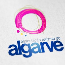
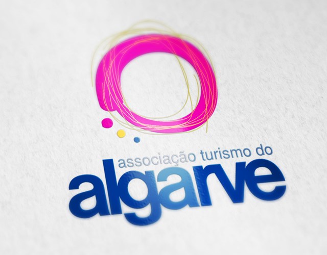
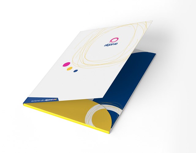
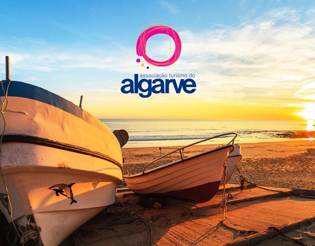
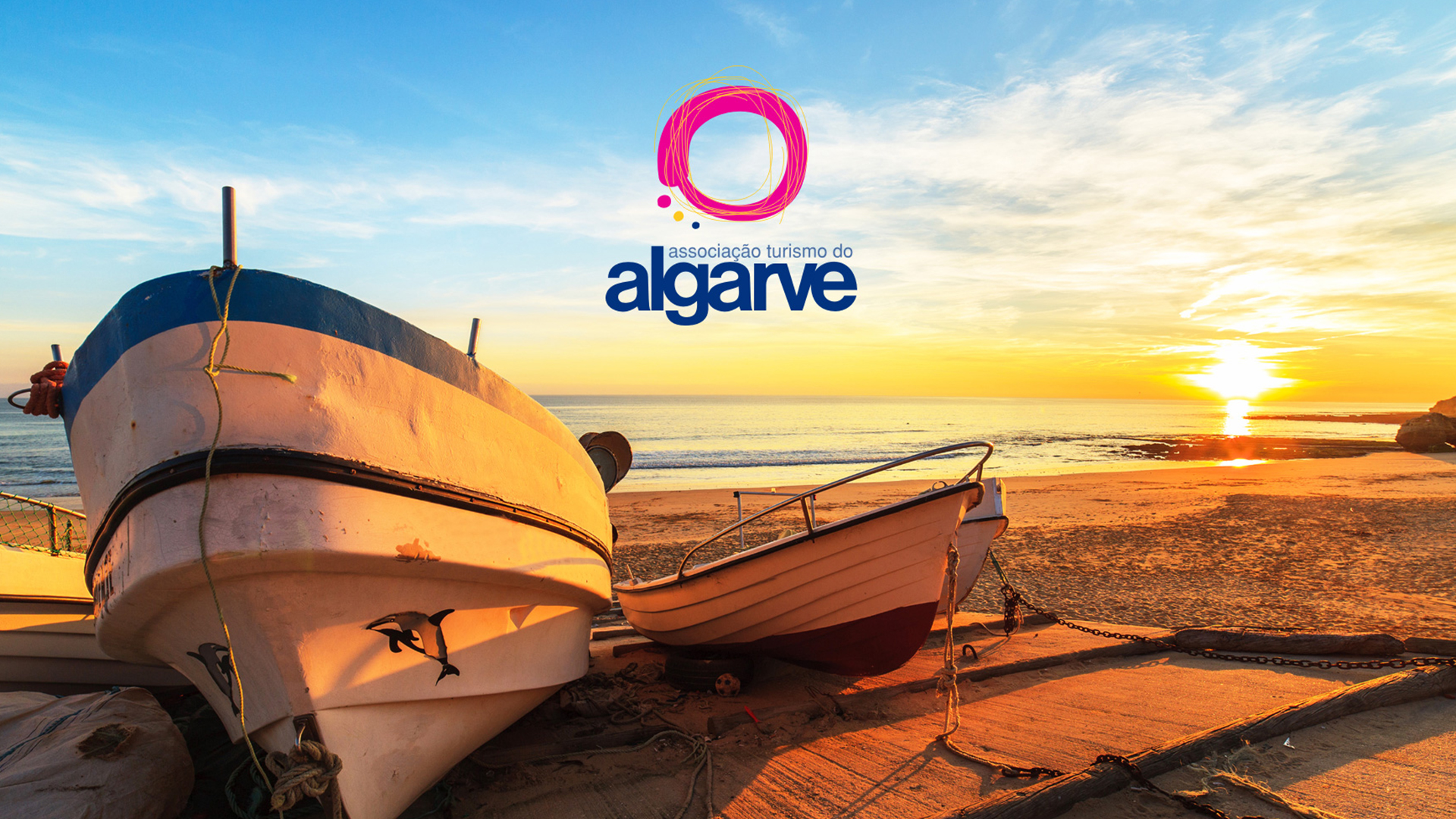
We designed the identifiable and differentiating image of the Algarve, assuming the most representative elements, the sun (life, light, dynamic, joyful), through the interweaving of outlined deep yellow lines; the earth (center, nature, environment), circular element of magenta color, central and unifying; the sea (active, fresh, mirror), is represented by the lettring of blue color; the people (reception, culture), are referenced by the three small representative circles also from the three sub-regions of the Algarve, arranged in an allusive way to the amphitheater to the sea.
The image developed reflects the modern, appealing and dynamic Algarve, projected into the future by its simple shapes, outlined lines, smooth lettering and striking colors.
The image developed reflects the modern, appealing and dynamic Algarve, projected into the future by its simple shapes, outlined lines, smooth lettering and striking colors.
Client
ATA - Associação de Turismo do Algarve
ATA - Associação de Turismo do Algarve
Service
Corporative image | Stands | Signage
Corporative image | Stands | Signage
 Brand - logotype
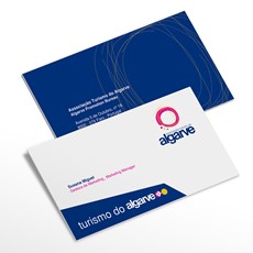
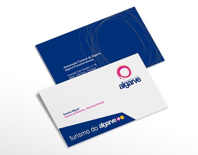
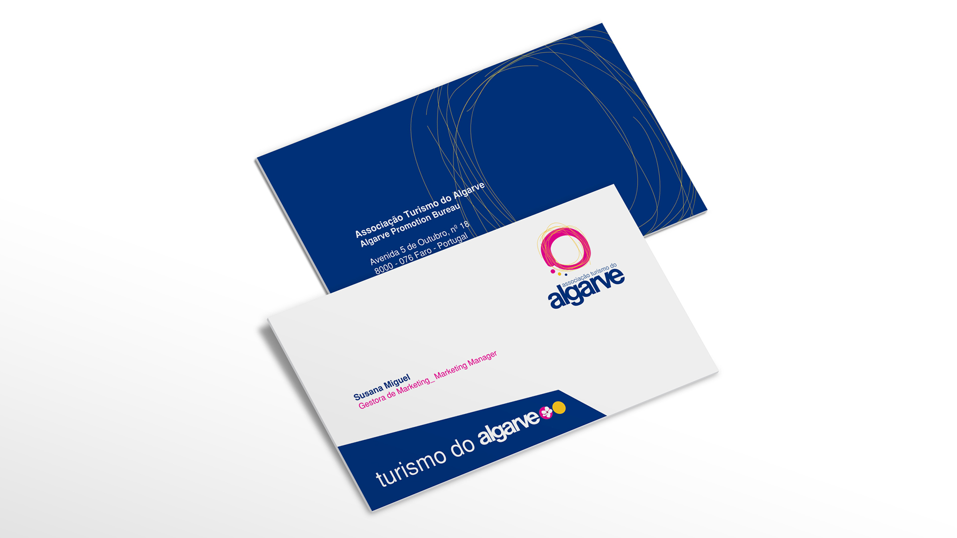 Business card
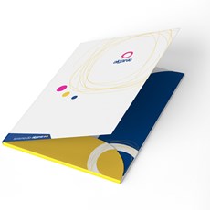
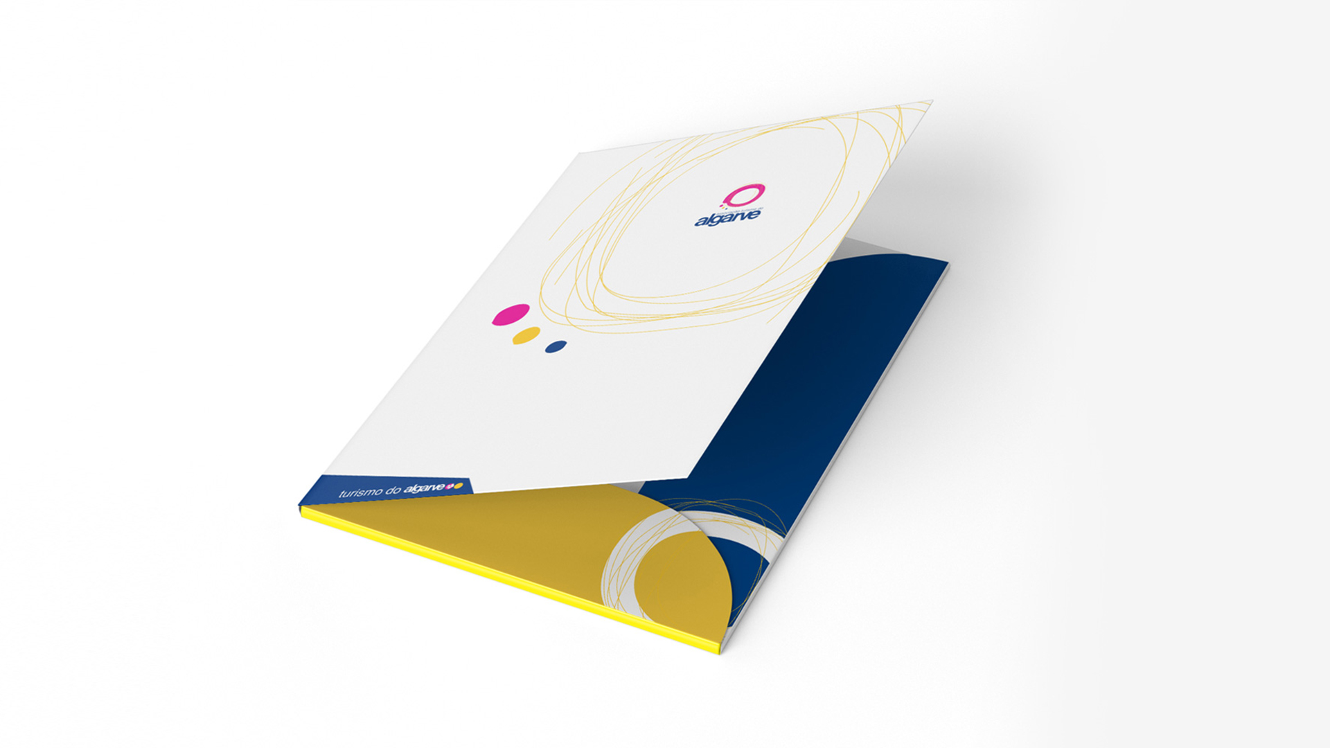 Folder
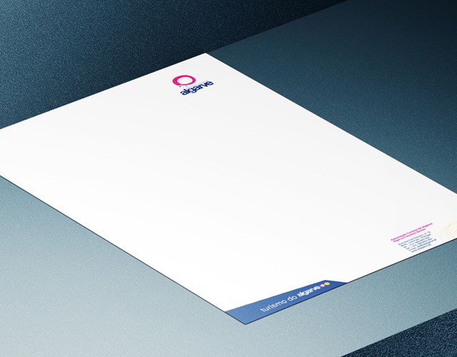
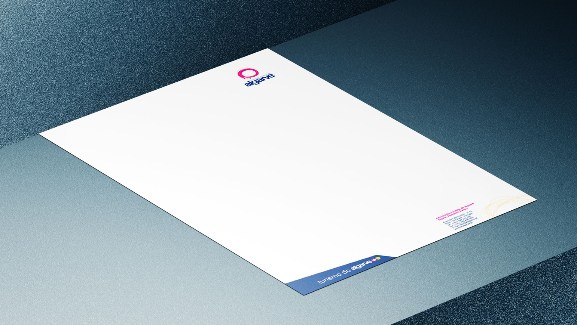 Stationary
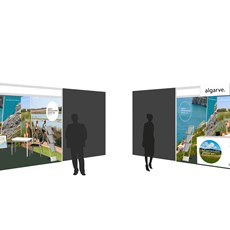
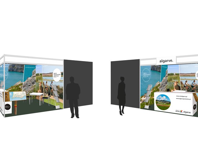
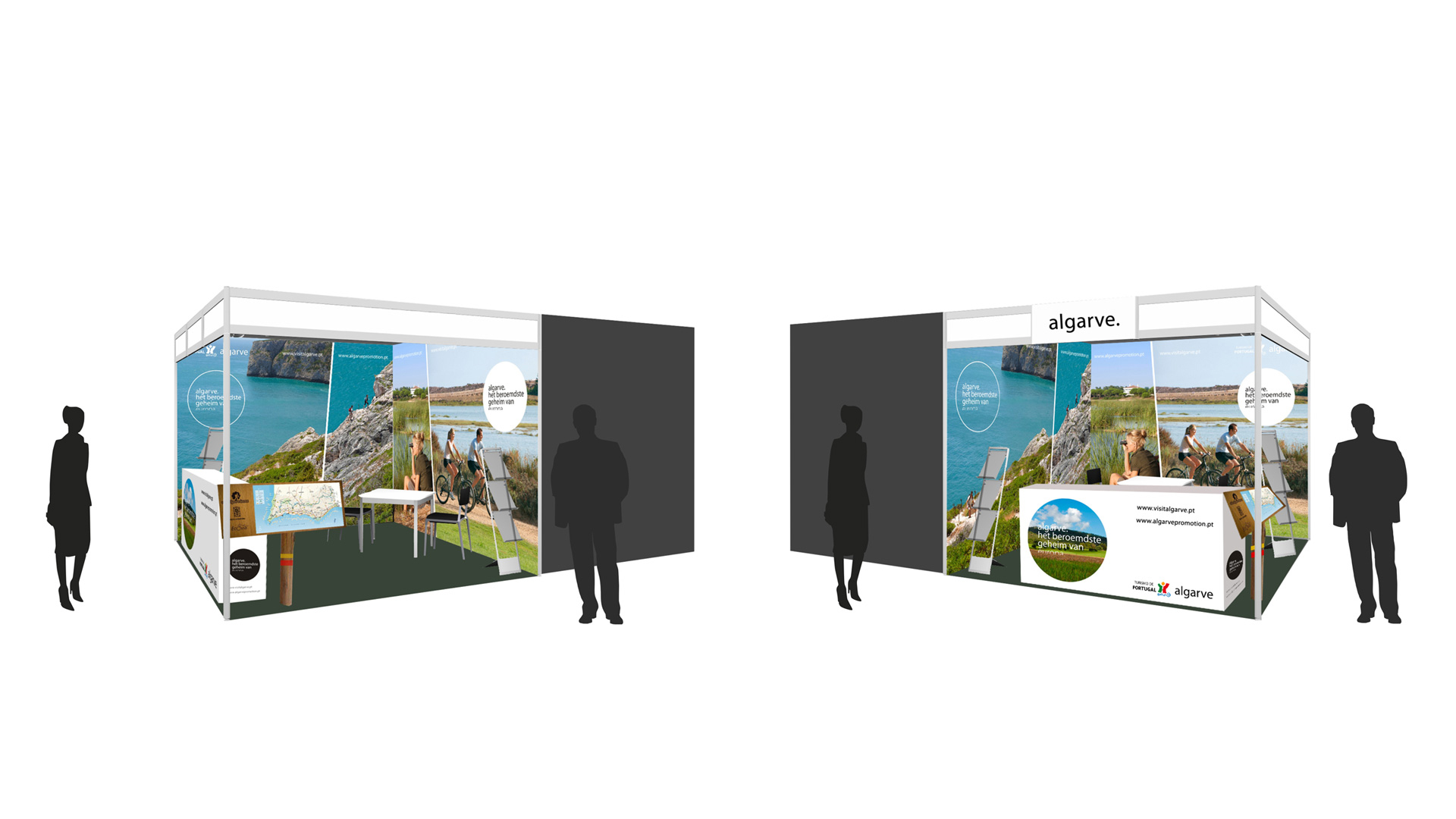 Stand Feira Fiets & Wandelbeurs - Amsterdam
